Podcast Center
 Video Center
 Webcasts
 Resource Center
 Events


 By
By  July 06, 2020 at 02:00 PM


The new COVID-19 tracking report from the U.S. Centers for Disease Control and Prevention (CDC) is showing that the CDC is continuing to have trouble giving health insurers, life insurers and other interested parties a clear picture of what’s happening with outbreak activity in the United States now.
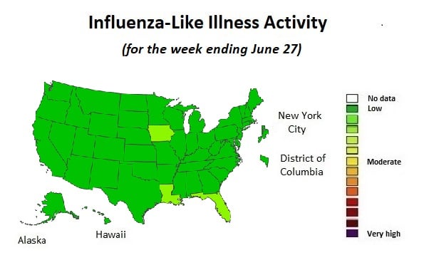
The CDC has been using a well-established “influenza-like illness” (ILI) activity tracking map to show what’s happening with new COVID-19, and COVID-19-like, cases out in the community.
Resources
- The CDC’s weekly COVID-19 report is available here.
- The CDC’s provisional COVID-19 mortality data table is available here.
- An image of what a Yahoo News reporter believes to be a leaked CDC COVID-19 new-case tracking map is available here.
- The COVID Tracking Project numbers are available here.
- The Johns Hopkins Coronavirus Resource Center numbers are available here.
- An overview article about the weekly COVID-19 report for the previous week is available here.
The map indicates roughly how many people are showing up in primary care offices, urgent care clinics and hospital emergency rooms with a fever, sore throat or other symptoms that could be caused by influenza, COVID-19, strep, or some other viral or bacterial upper respiratory infection.
The CDC uses ILI activity as a proxy for COVID-19, because it’s been much easier for doctors to tell whether patients have ILI symptoms than to get patients tested for SARS-CoV-2, the virus that causes COVID-19.
For the past few months, because the number of confirmed cases of flu has been very low, it’s seemed as if most of the ILI activity out in the community has been caused by the virus that causes COVID-19.
In April and May, the tracking map had red and orange fill, indicating high levels of ILI activity, in the states with high levels of COVID-19 activity.
But now, public health officials in Arizona, Florida, Texas, Southern California and other places are reporting spikes in new cases, and, in some cases, hospitalization rates, and the CDC tracking map continues to be all green. The fill color has flipped up to light green in Florida, Iowa and Louisiana, indicating that those states have a little ILI activity out in the community.
The CDC puts a new version of the map in its weekly COVIDView reports, which come out every Friday and generally cover the period up to the previous Saturday.
The CDC puts the tracking map in the reports, alongside hospitalization, mortality and lab test results reports.
The mortality report, for example, shows that the number of all deaths caused by COVID-19 and similar illnesses, as a percentage of all deaths, is now close to normal flu epidemic levels. In April, the percentage of all U.S. deaths caused by COVID-19 and COVID-19-look-alikes soared to about four times the the epidemic threshold level.
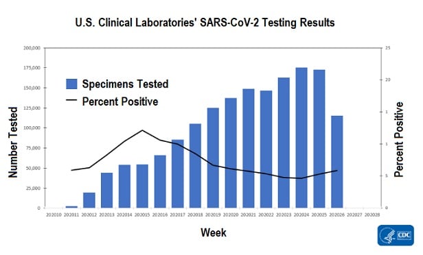
Some other charts in the COVIDView report, showing how many SARS-CoV-2 tests labs have run, and what percentage of samples turned out to contain SARS-CoV-2, do show a small uptick in SARS-CoV-2 activity.
The chart for U.S. clinical laboratories, for example, shows that the sample positivity rate has increased a little for the past three weeks.
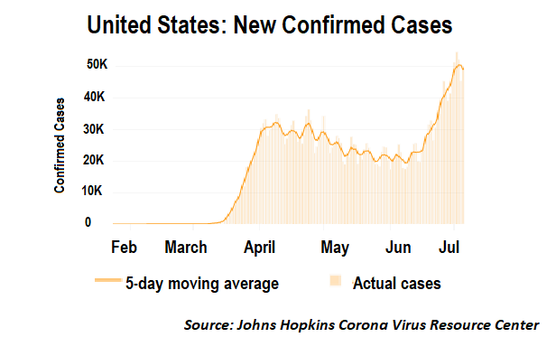
An independent COVID-19 tracking data provider, the Johns Hopkins Resource Center, shows, based on data from state and local government public health authorities, that the number of new cases began rising like a rocket in early May. The center is now recording an average of about 50,000 new cases per day.
That compares with the previous peak level, of about 30,000 new cases per day, in April, and is up from less than 25,000 per day in late May and early June.
The difference between the latest results and the April results could be partly due to expanded access to SARS-CoV-2 testing, but a comparison of the CDC testing numbers and the Johns Hopkins case counts suggests that the number of new cases is increasing faster than the number of tests being run.
The number of commercial lab SARS-CoV-2 tests seems to have increased about 50% in the four-week period ending June 20.
The Johns Hopkins case counts appear to have increased by more than 60% over the same period.
— Read 7 Reasons the U.S. COVID-19 Picture Is So Fuzzy, on ThinkAdvisor.
— Connect with ThinkAdvisor Life/Health on Facebook, LinkedIn and Twitter.


 Slideshow